Ratios and percentages
Ratio
In mathematics, a ratio indicates how many times one number contains another. For example, if there are eight oranges and six lemons in a bowl of fruit, then the ratio of oranges to lemons is eight to six (that is, 8∶6, which is equivalent to the ratio 4∶3). Similarly, the ratio of lemons to oranges is 6∶8 (or 3∶4) and the ratio of oranges to the total amount of fruit is 8∶14 (or 4∶7).
The numbers in a ratio may be quantities of any kind, such as counts of people or objects, or such as measurements of lengths, weights, time, etc. In most contexts, both numbers are restricted to be positive.
A ratio may be specified either by giving both constituting numbers, written as "a to b" or "a∶b", or by giving just the value of their quotient . Equal quotients correspond to equal ratios.
Consequently, a ratio may be considered as an ordered pair of numbers, a fraction with the first number in the numerator and the second in the denominator, or as the value denoted by this fraction. Ratios of counts, given by (non-zero) natural numbers, are rational numbers, and may sometimes be natural numbers. When two quantities are measured with the same unit, as is often the case, their ratio is a dimensionless number. A quotient of two quantities that are measured with different units is called a rate.
Simplify Fractions
If both the numerator and the denominator of a fraction are multiplied or divided by the same number, then the fraction does not change its value.
This means we can make some fractions simpler, by making the numbers involved smaller. When the numbers are as small as possible, the fraction is said to be expressed in its lowest terms, or reduced. Let's look at an example:
4/6 = 2/3.
Remember what that ' = ' sign means? It means that 4/6 and 2/3, although they look different, have the same value. Same value, different appearance.
This is because
- .
Try it out yourself with a calculator or with long division. From here, there is nothing we can divide both numbers by, so the fraction is reduced, which is our goal. To find out what to divide them by, you need to find a common divisor, which is a number they are both divisible by.
Percentages
Percentages are another way of representing rational numbers. Rational numbers can be represented as decimals, fractions or percentages.
Percent, when you actually break the word apart, consists of two words: per and cent. Per is a small but extremely powerful word. It means "to divide". Cent is a Latin word for 100. Percent, then, means "divide by 100".
To convert from a fraction to a percentage, we simply multiply the fraction by 100. For example, .
To convert from a decimal to a percentage, we first convert the decimal into a fraction, and then proceed with the approach outlined above. For example, .
Pie Charts
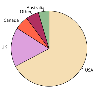
A Pie-Chart/Diagram is a graphical device - a circular shape broken into sub-divisions. The sub-divisions are called "sectors", whose areas are proportional to the various parts into which the whole quantity is divided. The sectors may be coloured differently to show the relationship of parts to the whole. A pie diagram is an alternative of the sub-divided bar diagram.
To construct a pie-chart, first we draw a circle of any suitable radius then the whole quantity which is to be divided is equated to 360 degrees. The different parts of the circle in terms of angles are calculated by the following formula.
Component Value / Whole Quantity * 360
The component parts i.e. sectors have been cut beginning from top in clockwise order.
Note that the percentages in a list may not add up to exactly 100% due to rounding. For example if a person spends a third of their time on each of three activities: 33%, 33% and 33% sums to 99%.
Warning: Pie charts are a poor way of communicating information. The eye is good at judging linear measures and bad at judging relative areas. A bar chart or dot chart is a preferable way of displaying this type of data.
Cleveland (1985), page 264: "Data that can be shown by pie charts always can be shown by a dot chart. This means that judgements of position along a common scale can be made instead of the less accurate angle judgments." This statement is based on the empirical investigations of Cleveland and McGill as well as investigations by perceptual psychologists.
Three-dimensional (3d) pie charts compound perceptual misinterpretation of statistical information by altering the relative angle of pie slices to create the impression of depth into a vanishing point. Angles and areas at the bottom of the chart must be exaggerated and the angles and areas at the top of the chart reduced in order to create the dimensional effect; a specifically false depiction of the data.


