Display of Categorical Data
Contents
Categorical variable
In statistics, a categorical variable (also called qualitative variable) is a variable that can take on one of a limited, and usually fixed, number of possible values, assigning each individual or other unit of observation to a particular group or nominal category on the basis of some qualitative property. In computer science and some branches of mathematics, categorical variables are referred to as enumerations or enumerated types. Commonly (though not in this article), each of the possible values of a categorical variable is referred to as a level. The probability distribution associated with a random categorical variable is called a categorical distribution.
Categorical data is the statistical data type consisting of categorical variables or of data that has been converted into that form, for example as grouped data. More specifically, categorical data may derive from observations made of qualitative data that are summarised as counts or cross tabulations, or from observations of quantitative data grouped within given intervals. Often, purely categorical data are summarised in the form of a contingency table. However, particularly when considering data analysis, it is common to use the term "categorical data" to apply to data sets that, while containing some categorical variables, may also contain non-categorical variables.
A categorical variable that can take on exactly two values is termed a binary variable or a dichotomous variable; an important special case is the Bernoulli variable. Categorical variables with more than two possible values are called polytomous variables; categorical variables are often assumed to be polytomous unless otherwise specified. Discretization is treating continuous data as if it were categorical. Dichotomization is treating continuous data or polytomous variables as if they were binary variables. Regression analysis often treats category membership with one or more quantitative dummy variables.
Examples of categorical variables
Examples of values that might be represented in a categorical variable:
- The roll of a six-sided die: possible outcomes are 1,2,3,4,5, or 6.
- Demographic information of a population: gender, disease status.
- The blood type of a person: A, B, AB or O.
- The political party that a voter might vote for, e. g. Green Party, Christian Democrat, Social Democrat, etc.
- The type of a rock: igneous, sedimentary or metamorphic.
- The identity of a particular word (e.g., in a language model): One of V possible choices, for a vocabulary of size V.
Data visualization
Data visualization (often abbreviated data viz) is an interdisciplinary field that deals with the graphic representation of data. It is a particularly efficient way of communicating when the data is numerous as for example a time series.
From an academic point of view, this representation can be considered as a mapping between the original data (usually numerical) and graphic elements (for example, lines or points in a chart). The mapping determines how the attributes of these elements vary according to the data. In this light, a bar chart is a mapping of the length of a bar to a magnitude of a variable. Since the graphic design of the mapping can adversely affect the readability of a chart, mapping is a core competency of Data visualization.
Data visualization has its roots in the field of Statistics and is therefore generally considered a branch of Descriptive Statistics. However, because both design skills and statistical and computing skills are required to visualize effectively, it is argued by some authors that it is both an Art and a Science.
Research into how people read and misread various types of visualizations is helping to determine what types and features of visualizations are most understandable and effective in conveying information.
To communicate information clearly and efficiently, data visualization uses statistical graphics, plots, information graphics and other tools. Numerical data may be encoded using dots, lines, or bars, to visually communicate a quantitative message. Effective visualization helps users analyze and reason about data and evidence. It makes complex data more accessible, understandable, and usable. Users may have particular analytical tasks, such as making comparisons or understanding causality, and the design principle of the graphic (i.e., showing comparisons or showing causality) follows the task. Tables are generally used where users will look up a specific measurement, while charts of various types are used to show patterns or relationships in the data for one or more variables.
Data visualization refers to the techniques used to communicate data or information by encoding it as visual objects (e.g., points, lines, or bars) contained in graphics. The goal is to communicate information clearly and efficiently to users. It is one of the steps in data analysis or data science. According to Vitaly Friedman (2008) the "main goal of data visualization is to communicate information clearly and effectively through graphical means. It doesn't mean that data visualization needs to look boring to be functional or extremely sophisticated to look beautiful. To convey ideas effectively, both aesthetic form and functionality need to go hand in hand, providing insights into a rather sparse and complex data set by communicating its key aspects in a more intuitive way. Yet designers often fail to achieve a balance between form and function, creating gorgeous data visualizations which fail to serve their main purpose — to communicate information".
Indeed, Fernanda Viegas and Martin M. Wattenberg suggested that an ideal visualization should not only communicate clearly, but stimulate viewer engagement and attention.
Data visualization is closely related to information graphics, information visualization, scientific visualization, exploratory data analysis and statistical graphics. In the new millennium, data visualization has become an active area of research, teaching and development. According to Post et al. (2002), it has united scientific and information visualization.
In the commercial environment data visualization is often referred to as dashboards. Infographics are another very common form of data visualization.
Characteristics of effective graphical displays

Professor Edward Tufte explained that users of information displays are executing particular analytical tasks such as making comparisons. The design principle of the information graphic should support the analytical task. As William Cleveland and Robert McGill show, different graphical elements accomplish this more or less effectively. For example, dot plots and bar charts outperform pie charts.
In his 1983 book The Visual Display of Quantitative Information, Edward Tufte defines 'graphical displays' and principles for effective graphical display in the following passage: "Excellence in statistical graphics consists of complex ideas communicated with clarity, precision, and efficiency. Graphical displays should:
"Excellence in statistical graphics consists of complex ideas communicated with clarity, precision, and efficiency. Graphical displays should:
- show the data
- induce the viewer to think about the substance rather than about methodology, graphic design, the technology of graphic production, or something else
- avoid distorting what the data has to say
- present many numbers in a small space
- make large data sets coherent
- encourage the eye to compare different pieces of data
- reveal the data at several levels of detail, from a broad overview to the fine structure
- serve a reasonably clear purpose: description, exploration, tabulation, or decoration
- be closely integrated with the statistical and verbal descriptions of a data set.
Graphics reveal data. Indeed graphics can be more precise and revealing than conventional statistical computations."
For example, the Minard diagram shows the losses suffered by Napoleon's army in the 1812–1813 period. Six variables are plotted: the size of the army, its location on a two-dimensional surface (x and y), time, the direction of movement, and temperature. The line width illustrates a comparison (size of the army at points in time), while the temperature axis suggests a cause of the change in army size. This multivariate display on a two-dimensional surface tells a story that can be grasped immediately while identifying the source data to build credibility. Tufte wrote in 1983 that: "It may well be the best statistical graphic ever drawn."
Not applying these principles may result in misleading graphs, distorting the message, or supporting an erroneous conclusion. According to Tufte, chartjunk refers to the extraneous interior decoration of the graphic that does not enhance the message or gratuitous three-dimensional or perspective effects. Needlessly separating the explanatory key from the image itself, requiring the eye to travel back and forth from the image to the key, is a form of "administrative debris." The ratio of "data to ink" should be maximized, erasing non-data ink where feasible.
The Congressional Budget Office summarized several best practices for graphical displays in a June 2014 presentation. These included: a) Knowing your audience; b) Designing graphics that can stand alone outside the report's context; and c) Designing graphics that communicate the key messages in the report.
Quantitative messages


Author Stephen Few described eight types of quantitative messages that users may attempt to understand or communicate from a set of data and the associated graphs used to help communicate the message:
- Time-series: A single variable is captured over a period of time, such as the unemployment rate over a 10-year period. A line chart may be used to demonstrate the trend.
- Ranking: Categorical subdivisions are ranked in ascending or descending order, such as a ranking of sales performance (the measure) by sales persons (the category, with each sales person a categorical subdivision) during a single period. A bar chart may be used to show the comparison across the sales persons.
- Part-to-whole: Categorical subdivisions are measured as a ratio to the whole (i.e., a percentage out of 100%). A pie chart or bar chart can show the comparison of ratios, such as the market share represented by competitors in a market.
- Deviation: Categorical subdivisions are compared against a reference, such as a comparison of actual vs. budget expenses for several departments of a business for a given time period. A bar chart can show comparison of the actual versus the reference amount.
- Frequency distribution: Shows the number of observations of a particular variable for given interval, such as the number of years in which the stock market return is between intervals such as 0-10%, 11-20%, etc. A histogram, a type of bar chart, may be used for this analysis. A boxplot helps visualize key statistics about the distribution, such as median, quartiles, outliers, etc.
- Correlation: Comparison between observations represented by two variables (X,Y) to determine if they tend to move in the same or opposite directions. For example, plotting unemployment (X) and inflation (Y) for a sample of months. A scatter plot is typically used for this message.
- Nominal comparison: Comparing categorical subdivisions in no particular order, such as the sales volume by product code. A bar chart may be used for this comparison.
- Geographic or geospatial: Comparison of a variable across a map or layout, such as the unemployment rate by state or the number of persons on the various floors of a building. A cartogram is a typical graphic used.
Analysts reviewing a set of data may consider whether some or all of the messages and graphic types above are applicable to their task and audience. The process of trial and error to identify meaningful relationships and messages in the data is part of exploratory data analysis.
Visual perception and data visualization
A human can distinguish differences in line length, shape, orientation, distances, and color (hue) readily without significant processing effort; these are referred to as "pre-attentive attributes". For example, it may require significant time and effort ("attentive processing") to identify the number of times the digit "5" appears in a series of numbers; but if that digit is different in size, orientation, or color, instances of the digit can be noted quickly through pre-attentive processing.
Compelling graphics take advantage of pre-attentive processing and attributes and the relative strength of these attributes. For example, since humans can more easily process differences in line length than surface area, it may be more effective to use a bar chart (which takes advantage of line length to show comparison) rather than pie charts (which use surface area to show comparison).
Human perception/cognition and data visualization
Almost all data visualizations are created for human consumption. Knowledge of human perception and cognition is necessary when designing intuitive visualizations. Cognition refers to processes in human beings like perception, attention, learning, memory, thought, concept formation, reading, and problem solving. Human visual processing is efficient in detecting changes and making comparisons between quantities, sizes, shapes and variations in lightness. When properties of symbolic data are mapped to visual properties, humans can browse through large amounts of data efficiently. It is estimated that 2/3 of the brain's neurons can be involved in visual processing. Proper visualization provides a different approach to show potential connections, relationships, etc. which are not as obvious in non-visualized quantitative data. Visualization can become a means of data exploration.
Studies have shown individuals used on average 19% less cognitive resources, and 4.5% better able to recall details when comparing data visualization with text.
Techniques
| Name | Visual dimensions | Description / Example usages | |
|---|---|---|---|
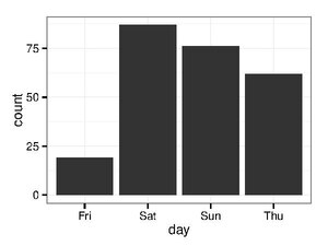
| Bar chart |
|
| |
|
Variable-width ("variwide") bar chart |
|
| |
 (1) Frequency and (2) intensity of extreme weather events are connected in pairs of horizontal and vertical bars, respectively. Bars are distinguished by (3) color-coded primary category (degree of global warming). Additionally, a common horizontal axis may be used on (4) a secondary category (type of weather event). |
Orthogonal (orthogonal composite) bar chart |
|
|
| Histogram |
|
| |
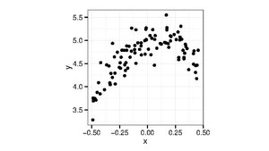
| Scatter plot |
|
| |
| Scatter plot (3D) |
|
| |
| Network |
|
| |
| Pie chart |
|
| |
| Line chart |
|
| |
| Streamgraph |
|
| |
| Treemap |
|
| |
| Gantt chart |
|
| |
| Heat map |
|
| |
| Stripe graphic |
|
| |
| Animated spiral graphic |
|
| |
| Box and Whisker Plot |
|
| |
| Flowchart |
|
| |
| Radar chart |
|
| |
| Venn diagram |
|
| |
| Iconography of correlations |
|
|


_-_avg_above-_and_below-ice_readings.png)


.png)
Licensing
Content obtained and/or adapted from:
- Categorical variable, Wikipedia under a CC BY-SA license
- Data visualization, Wikipedia under a CC BY-SA license