Difference between revisions of "Display of Numerical Data"
| Line 1: | Line 1: | ||
| + | = Bar graphs = | ||
[[File:Human losses of world war two by country.png|thumb|upright=1.4|Example of a grouped (clustered) bar chart, one with horizontal bars.]] | [[File:Human losses of world war two by country.png|thumb|upright=1.4|Example of a grouped (clustered) bar chart, one with horizontal bars.]] | ||
A '''bar chart''' or '''bar graph''' is a chart or graph that presents categorical data with rectangular bars with heights or lengths proportional to the values that they represent. The bars can be plotted vertically or horizontally. A vertical bar chart is sometimes called a '''column chart'''. | A '''bar chart''' or '''bar graph''' is a chart or graph that presents categorical data with rectangular bars with heights or lengths proportional to the values that they represent. The bars can be plotted vertically or horizontally. A vertical bar chart is sometimes called a '''column chart'''. | ||
| Line 24: | Line 25: | ||
</gallery> | </gallery> | ||
| − | == Licensing | + | = Dot plots = |
| + | A '''dot chart''' or '''dot plot''' is a statistical chart consisting of data points plotted on a fairly simple scale, typically using filled in circles. There are two common, yet very different, versions of the dot chart. The first has been used in hand-drawn (pre-computer era) graphs to depict distributions going back to 1884. The other version is described by William S. Cleveland as an alternative to the bar chart, in which dots are used to depict the quantitative values (e.g. counts) associated with categorical variables. | ||
| + | |||
| + | ==Of a distribution== | ||
| + | [[File:Dotplot of random values 2.png|thumb|A dot plot of 50 random values from 0 to 9.]] | ||
| + | The dot plot as a representation of a distribution consists of group of data points plotted on a simple scale. Dot plots are used for continuous, quantitative, univariate data. Data points may be labelled if there are few of them. | ||
| + | |||
| + | Dot plots are one of the simplest statistical plots, and are suitable for small to moderate sized data sets. They are useful for highlighting clusters and gaps, as well as outliers. Their other advantage is the conservation of numerical information. When dealing with larger data sets (around 20–30 or more data points) the related stemplot, box plot or histogram may be more efficient, as dot plots may become too cluttered after this point. Dot plots may be distinguished from histograms in that dots are not spaced uniformly along the horizontal axis. | ||
| + | |||
| + | Although the plot appears to be simple, its computation and the statistical theory underlying it are not simple. The algorithm for computing a dot plot is closely related to kernel density estimation. The size chosen for the dots affects the appearance of the plot. Choice of dot size is equivalent to choosing the bandwidth for a kernel density estimate. | ||
| + | |||
| + | In the ''R'' programming language this type of plot is also referred to as a '''stripchart''' or '''stripplot'''. | ||
| + | |||
| + | ==Cleveland dot plots== | ||
| + | [[File:Dotplot-example.svg|thumb|Example of a Cleveland dot plot, showing the death rates per 1000 in Virginia in 1940]] | ||
| + | Dot plot may also refer to plots of points that each belong to one of several categories. They are an alternative to bar charts or pie charts, and look somewhat like a horizontal bar chart where the bars are replaced by a dots at the values associated with each category. Compared to (vertical) bar charts and pie charts, Cleveland argues that dot plots allow more accurate interpretation of the graph by readers by making the labels easier to read, reducing non-data ink (or graph clutter) and supporting table look-up. | ||
| + | |||
| + | = Licensing = | ||
Content obtained and/or adapted from: | Content obtained and/or adapted from: | ||
* [https://en.wikipedia.org/wiki/Bar_chart Bar chart, Wikipedia] under a CC BY-SA license | * [https://en.wikipedia.org/wiki/Bar_chart Bar chart, Wikipedia] under a CC BY-SA license | ||
| + | * [https://en.wikipedia.org/wiki/Dot_plot_(statistics) Dot plot (statistics), Wikipedia] under a CC BY-SA license | ||
Revision as of 00:08, 18 December 2021
Contents
Bar graphs
A bar chart or bar graph is a chart or graph that presents categorical data with rectangular bars with heights or lengths proportional to the values that they represent. The bars can be plotted vertically or horizontally. A vertical bar chart is sometimes called a column chart.
Usage
Bar graphs/charts provide a visual presentation of categorical data. Categorical data is a grouping of data into discrete groups, such as months of the year, age group, shoe sizes, and animals. These categories are usually qualitative. In a column (vertical) bar chart, categories appear along the horizontal axis and the height of the bar corresponds to the value of each category.
Bar charts have a discrete domain of categories, and are usually scaled so that all the data can fit on the chart. When there is no natural ordering of the categories being compared, bars on the chart may be arranged in any order. Bar charts arranged from highest to lowest incidence are called Pareto charts.
Grouped (clustered) and stacked
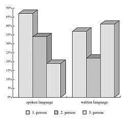
Bar graphs can also be used for more complex comparisons of data with grouped (or "clustered") bar charts, and stacked bar charts.
In grouped (clustered) bar charts, for each categorical group there are two or more bars color-coded to represent a particular grouping. For example, a business owner with two stores might make a grouped bar chart with different colored bars to represent each store: the horizontal axis would show the months of the year and the vertical axis would show revenue.
Alternatively, a stacked bar chart stacks bars on top of each other so that the height of the resulting stack shows the combined result. Stacked bar charts are not suited to data sets having both positive and negative values.
Grouped bar charts usually present the information in the same order in each grouping. Stacked bar charts present the information in the same sequence on each bar.
Dot plots
A dot chart or dot plot is a statistical chart consisting of data points plotted on a fairly simple scale, typically using filled in circles. There are two common, yet very different, versions of the dot chart. The first has been used in hand-drawn (pre-computer era) graphs to depict distributions going back to 1884. The other version is described by William S. Cleveland as an alternative to the bar chart, in which dots are used to depict the quantitative values (e.g. counts) associated with categorical variables.
Of a distribution
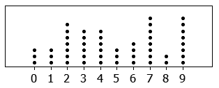
The dot plot as a representation of a distribution consists of group of data points plotted on a simple scale. Dot plots are used for continuous, quantitative, univariate data. Data points may be labelled if there are few of them.
Dot plots are one of the simplest statistical plots, and are suitable for small to moderate sized data sets. They are useful for highlighting clusters and gaps, as well as outliers. Their other advantage is the conservation of numerical information. When dealing with larger data sets (around 20–30 or more data points) the related stemplot, box plot or histogram may be more efficient, as dot plots may become too cluttered after this point. Dot plots may be distinguished from histograms in that dots are not spaced uniformly along the horizontal axis.
Although the plot appears to be simple, its computation and the statistical theory underlying it are not simple. The algorithm for computing a dot plot is closely related to kernel density estimation. The size chosen for the dots affects the appearance of the plot. Choice of dot size is equivalent to choosing the bandwidth for a kernel density estimate.
In the R programming language this type of plot is also referred to as a stripchart or stripplot.
Cleveland dot plots
Dot plot may also refer to plots of points that each belong to one of several categories. They are an alternative to bar charts or pie charts, and look somewhat like a horizontal bar chart where the bars are replaced by a dots at the values associated with each category. Compared to (vertical) bar charts and pie charts, Cleveland argues that dot plots allow more accurate interpretation of the graph by readers by making the labels easier to read, reducing non-data ink (or graph clutter) and supporting table look-up.
Licensing
Content obtained and/or adapted from:
- Bar chart, Wikipedia under a CC BY-SA license
- Dot plot (statistics), Wikipedia under a CC BY-SA license


