Graphical Display
A chart is a graphical representation for data visualization, in which "the data is represented by symbols, such as bars in a bar chart, lines in a line chart, or slices in a pie chart". A chart can represent tabular numeric data, functions or some kinds of quality structure and provides different info.
The term "chart" as a graphical representation of data has multiple meanings:
- A data chart is a type of diagram or graph, that organizes and represents a set of numerical or qualitative data.
- Maps that are adorned with extra information (map surround) for a specific purpose are often known as charts, such as a nautical chart or aeronautical chart, typically spread over several map sheets.
- Other domain-specific constructs are sometimes called charts, such as the chord chart in music notation or a record chart for album popularity.
Charts are often used to ease understanding of large quantities of data and the relationships between parts of the data. Charts can usually be read more quickly than the raw data. They are used in a wide variety of fields, and can be created by hand (often on graph paper) or by computer using a charting application. Certain types of charts are more useful for presenting a given data set than others. For example, data that presents percentages in different groups (such as "satisfied, not satisfied, unsure") are often displayed in a pie chart, but maybe more easily understood when presented in a horizontal bar chart. On the other hand, data that represents numbers that change over a period of time (such as "annual revenue from 1990 to 2000") might be best shown as a line chart.
Features
A chart can take a large variety of forms. However, there are common features that provide the chart with its ability to extract meaning from data.
Typically the data in a chart is represented graphically since humans can infer meaning from pictures more quickly than from text. Thus, the text is generally used only to annotate the data.
One of the most important uses of text in a graph is the title. A graph's title usually appears above the main graphic and provides a succinct description of what the data in the graph refers to.
Dimensions in the data are often displayed on axes. If a horizontal and a vertical axis are used, they are usually referred to as the x-axis and y-axis. Each axis will have a scale, denoted by periodic graduations and usually accompanied by numerical or categorical indications. Each axis will typically also have a label displayed outside or beside it, briefly describing the dimension represented. If the scale is numerical, the label will often be suffixed with the unit of that scale in parentheses. For example, "Distance traveled (m)" is a typical x-axis label and would mean that the distance traveled, in units of meters, is related to the horizontal position of the data within the chart.
Within the graph, a grid of lines may appear to aid in the visual alignment of data. The grid can be enhanced by visually emphasizing the lines at regular or significant graduations. The emphasized lines are then called major gridlines, and the remainder is minor grid lines.
A chart's data can appear in all manner of formats and may include individual textual labels describing the datum associated with the indicated position in the chart. The data may appear as dots or shapes, connected or unconnected, and in any combination of colors and patterns. In addition, inferences or points of interest can be overlaid directly on the graph to further aid information extraction.
When the data appearing in a chart contains multiple variables, the chart may include a legend (also known as a key). A legend contains a list of the variables appearing in the chart and an example of their appearance. This information allows the data from each variable to be identified in the chart.
Types
Common charts
Four of the most common charts are:
This gallery shows:
- A histogram consists of tabular frequencies, shown as adjacent rectangles, erected over discrete intervals (bins), with an area equal to the frequency of the observations in the interval; first introduced by Karl Pearson.
- A bar chart is a chart with rectangular bars with lengths proportional to the values that they represent. The bars can be plotted vertically or horizontally. The first known bar charts are usually attributed to Nicole Oresme, Joseph Priestley, and William Playfair.
- A pie chart shows percentage values as a slice of a pie; first introduced by William Playfair.
- A line chart is a two-dimensional scatterplot of ordered observations where the observations are connected following their order. The first known line charts are usually credited to Francis Hauksbee, Nicolaus Samuel Cruquius, Johann Heinrich Lambert and William Playfair.
Other common charts are:
Mean
The mean, or more precisely the arithmetic mean, is simply the arithmetic average of a group of numbers (or data set) and is shown using -bar symbol . So the mean of the variable is , pronounced "x-bar". It is calculated by adding up all of the values in a data set and dividing by the number of values in that data set :.For example, take the following set of data: {1,2,3,4,5}. The mean of this data would be:
Here is a more complicated data set: {10,14,86,2,68,99,1}. The mean would be calculated like this:
Dot plots
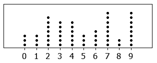
The dot plot as a representation of a distribution consists of group of data points plotted on a simple scale. Dot plots are used for continuous, quantitative, univariate data. Data points may be labelled if there are few of them.
Dot plots are one of the simplest statistical plots, and are suitable for small to moderate sized data sets. They are useful for highlighting clusters and gaps, as well as outliers. Their other advantage is the conservation of numerical information. When dealing with larger data sets (around 20–30 or more data points) the related stem plot, box plot or histogram may be more efficient, as dot plots may become too cluttered after this point. Dot plots may be distinguished from histograms in that dots are not spaced uniformly along the horizontal axis.
Although the plot appears to be simple, its computation and the statistical theory underlying it are not simple. The algorithm for computing a dot plot is closely related to kernel density estimation. The size chosen for the dots affects the appearance of the plot. Choice of dot size is equivalent to choosing the bandwidth for a kernel density estimate.
In the R programming language this type of plot is also referred to as a stripchart
Histogram
A histogram is an approximate representation of the distribution of numerical data. It was first introduced by Karl Pearson. To construct a histogram, the first step is to "bin" (or "bucket") the range of values—that is, divide the entire range of values into a series of intervals—and then count how many values fall into each interval. The bins are usually specified as consecutive, non-overlapping intervals of a variable. The bins (intervals) must be adjacent and are often (but not required to be) of equal size.
If the bins are of equal size, a rectangle is erected over the bin with height proportional to the frequency—the number of cases in each bin. A histogram may also be normalized to display "relative" frequencies. It then shows the proportion of cases that fall into each of several categories, with the sum of the heights equaling 1.
However, bins need not be of equal width; in that case, the erected rectangle is defined to have its area proportional to the frequency of cases in the bin. The vertical axis is then not the frequency but frequency density—the number of cases per unit of the variable on the horizontal axis. Examples of variable bin width are displayed on Census bureau data below.
As the adjacent bins leave no gaps, the rectangles of a histogram touch each other to indicate that the original variable is continuous.
Histograms give a rough sense of the density of the underlying distribution of the data, and often for density estimation: estimating the probability density function of the underlying variable. The total area of a histogram used for probability density is always normalized to 1. If the length of the intervals on the x-axis are all 1, then a histogram is identical to a relative frequency plot.
A histogram can be thought of as a simplistic kernel density estimation, which uses a kernel to smooth frequencies over the bins. This yields a smoother probability density function, which will in general more accurately reflect distribution of the underlying variable. The density estimate could be plotted as an alternative to the histogram, and is usually drawn as a curve rather than a set of boxes. Histograms are nevertheless preferred in applications, when their statistical properties need to be modeled. The correlated variation of a kernel density estimate is very difficult to describe mathematically, while it is simple for a histogram where each bin varies independently.
An alternative to kernel density estimation is the average shifted histogram, which is fast to compute and gives a smooth curve estimate of the density without using kernels.
The histogram is one of the seven basic tools of quality control.
Histograms are sometimes confused with bar charts. A histogram is used for continuous data, where the bins represent ranges of data, while a bar chart is a plot of categorical variables. Some authors recommend that bar charts have gaps between the rectangles to clarify the distinction.
Examples
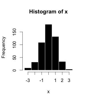
This is the data for the histogram to the right, using 500 items:
| Bin/Interval | Count/Frequency |
|---|---|
| −3.5 to −2.51 | 9 |
| −2.5 to −1.51 | 32 |
| −1.5 to −0.51 | 109 |
| −0.5 to 0.49 | 180 |
| 0.5 to 1.49 | 132 |
| 1.5 to 2.49 | 34 |
| 2.5 to 3.49 | 4 |
The words used to describe the patterns in a histogram are: "symmetric", "skewed left" or "right", "unimodal", "bimodal" or "multimodal".
It is a good idea to plot the data using several different bin widths to learn more about it. Here is an example on tips given in a restaurant.
The U.S. Census Bureau found that there were 124 million people who work outside of their homes. Using their data on the time occupied by travel to work, the table below shows the absolute number of people who responded with travel times "at least 30 but less than 35 minutes" is higher than the numbers for the categories above and below it. This is likely due to people rounding their reported journey time. The problem of reporting values as somewhat arbitrarily rounded numbers is a common phenomenon when collecting data from people.
Data by absolute numbers Interval Width Quantity Quantity/width 0 5 4180 836 5 5 13687 2737 10 5 18618 3723 15 5 19634 3926 20 5 17981 3596 25 5 7190 1438 30 5 16369 3273 35 5 3212 642 40 5 4122 824 45 15 9200 613 60 30 6461 215 90 60 3435 57
This histogram shows the number of cases per unit interval as the height of each block, so that the area of each block is equal to the number of people in the survey who fall into its category. The area under the curve represents the total number of cases (124 million). This type of histogram shows absolute numbers, with Q in thousands.
Licensing
Content obtained and/or adapted from:
- Chart, Wikipedia under a CC BY-SA license


